There’s a need to reconnect the digital to the physical, from minerals and energy to the physical infrastructure that powers the internet. We have to repurpose our digital design processes to consider and reflect these ecological needs, instead of optimising only for business and growth objectives, to achieve more transactions, interactions and attention.
One of the ways we can do this is by lowering the energy demand of the digital products and services we’re designing, making it more accessible to people with slower internet connections or on older devices. For Branch we wanted to design something that still looked designed, and worked at a low bandwidth environment, but didn’t end up looking too anodyne.
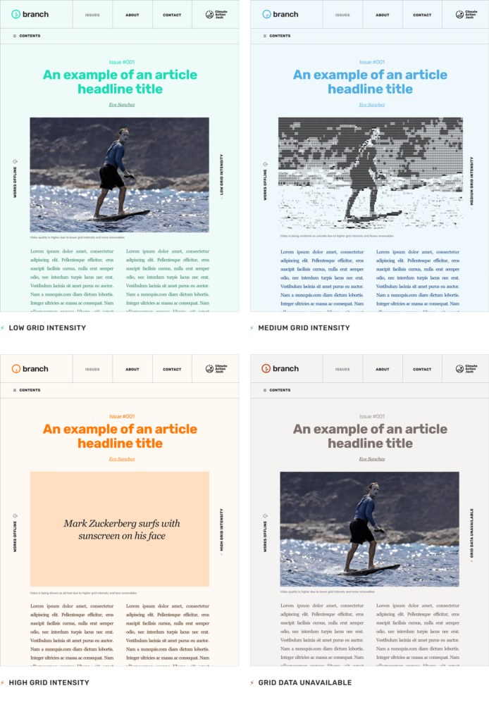
Branch was also designed to be ‘Demand Responsive’ to adapt to and reflect the physical infrastructure of the internet and the energy behind it. Utilising data from a grid intensity API and the user’s location, Branch has different interface designs that are shown dependent on the current energy demand and fossil fuels on the grid where the user is. There are 4 different design states:
1. Lower grid demand, more renewables
The first design state is when grid demand is lower and has a higher concentration of renewables, here the site shows the full experience with all images, videos and media content automatically loaded.
2. Medium grid demand, fewer renewables
If the grid demand increases and is medium intensity with fewer renewables, we display lighter unicode renderings of images and videos.
3. Higher grid demand, less renewables
When grid demand is high and less renewables are being used we reverse the way media content is shown by emphasising the alt text instead. The user can click to reveal the content if they wish, but it is not automatically loaded for them, this also creates the need to craft alt texts to make them much more descriptive than they may usually be.
4. Grid data unavailable
Sometimes the technology we rely on goes down or simply doesn’t work, and that’s another important reflection of the physical infrastructure behind it. So when the grid intensity API we use for Branch is down or unavailable, we designed a state to show this too.
The logo was designed to indicate these different states, with the graphical branch element getting greener to show when more renewables are on the grid.

As well as this responsiveness the Branch site has also been designed to be as low energy as possible. This includes using a limited number of fonts and utilizing system fonts, reducing image weight when they’re shown and designing in a way that doesn’t need lots of javascript to render.
Another feature is that Branch is that it is “available offline”, this allows users to access the site even without an internet connection by caching. This often forgotten feature is a simple counter to the idea of being constantly connected and could even become increasingly necessary if the physical infrastructure of the internet becomes more unreliable due to environmental changes.
Hopefully Branch can demonstrate some ways of thinking about designing digital technology in a more ecologically aware way and continue the conversations that are happening in this area to try and help build out some design principles. I have started by laying out some of the design principles I think may be worth considering when designing digital products and services in a more carbon aware and sustainable way
Carbon and energy conscious design
A slower and more energy intensive internet benefits no one. If we’re going to build an internet that is future-proof and runs off renewables, it needs to be lighter, less energy intensive and decentralised, moving away from a reliance on a handful of tech stack monopolies.
Not putting the burden on the users
This shouldn’t be about shaming individual habits, it’s counter-productive to data shame users. Those of us designing and building these digital products and services should be the ones taking responsibility for ensuring that they’re fit for a more sustainable world.
You don’t have to sacrifice experience
A lot of design is ultimately problem solving and we shouldn’t shy away from constraints, instead consider them a gift and use them to still create incredible and usable experiences. The idea of designing with no concern to weight or restrictions is a relatively new phenomenon anyway.
Disconnect from the ad networks
Analytics, ads and tracking are energy intensive components of a site or platform. Disconnecting from these allows us to make digital products and services lighter and data privacy clearer and more transparent. Try using cookie free, independent analytics platforms such as Cabin.
Attention-economy
Digital interfaces have seemingly morphed into a homogeneous digital feed, a sea of scrolling images, videos and content optimised to keep users attention, this is also very energy intensive. We need to cut the noise and provide users with a calmer and more considered experience that allows them to choose what they look at rather than an algorithm deciding and auto-loading what might keep a user’s attention the longest.
Challenge infinite digital growth
Consider asking if what we’re designing extends the reach and power of the existing tech monopolies and their privatisation of this infrastructure. Also do the benefits of the digital product or service balance or outweigh the energy and carbon cost and does it encourage the use or extraction of more finite resources.
About the author
Tom Jarrett is a designer exploring sustainable interaction design and designing digital products and services to work within ecological limits. See more at tomjarrett.earth